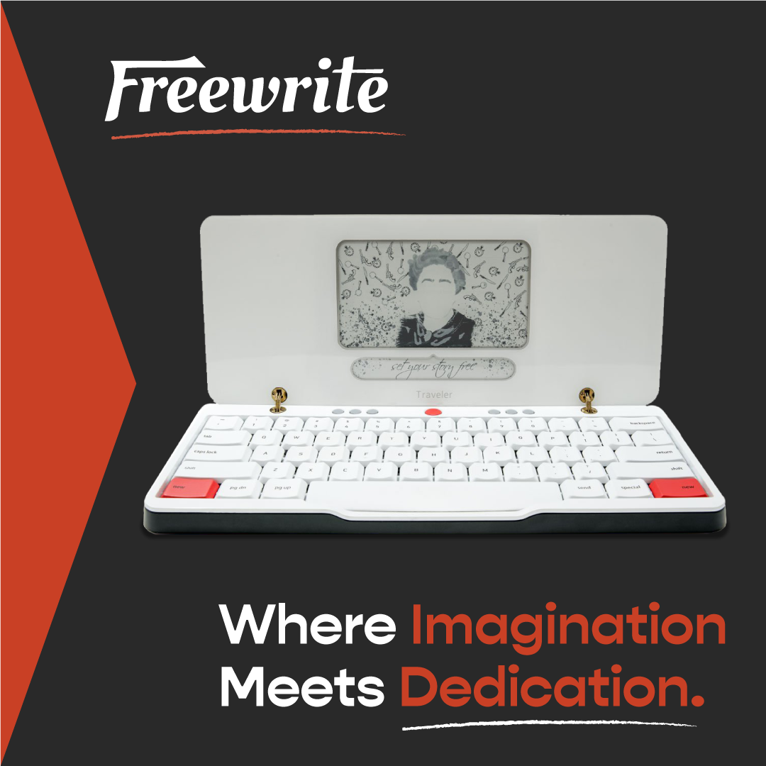
On the first slide, I delved into the core elements of Freewrite's existing identity – from the logo to the color palette and font choices. I articulated my vision for the graphics, demonstrating how the proposed elements would seamlessly weave the brand's essence into the fabric of its digital presence and social platforms.
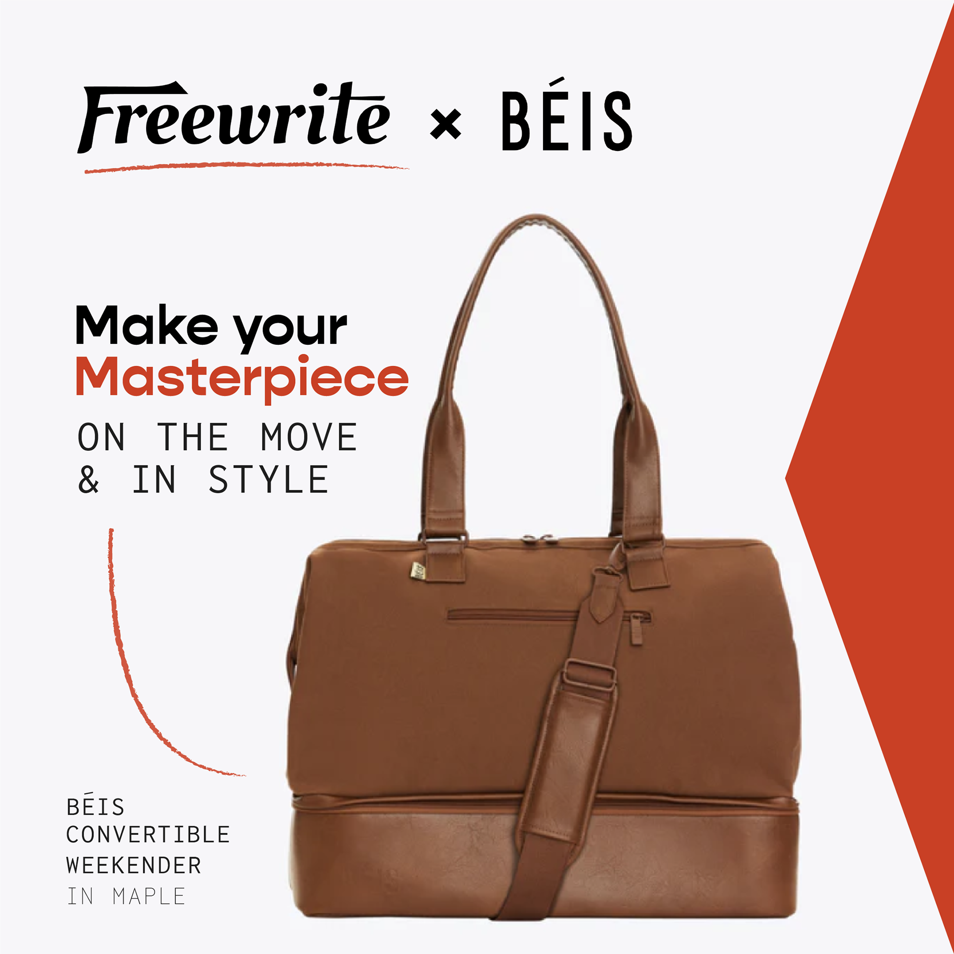
Moving to the second slide, I unveiled a series of mock graphics designed for Freewrite's social media. Tasked with crafting an ad for an imaginary Freewrite product, I conceptualized a collaborative venture with Beis, introducing a line of opulent travel bags tailored for Freewrite enthusiasts. This marked the introduction of the "return" element – a dynamic triangle designed to captivate attention while infusing meaning and a sentimental element into the brand. The addition of a textured stroke brought color, texture, and visual intrigue, emphasizing specific areas within the graphics.
In the final slide, I presented a mock web banner for a fictional Black Friday sale. Although the initial request only stipulated one graphic, I opted to showcase a second option, illustrating the unified application of brand elements across diverse channels. Recognizing the predominantly white website backdrop, I strategically introduced their darker brand color to elevate the visibility of the sale and enhance the overall aesthetic. My use of the return element and textured stroke persisted, reinforcing the cohesive motif.
Reflecting on the journey, it's gratifying to observe Freewrite's responsive integration of some suggestions into their updated site and social graphics. The introduction of the accent color and the consistent use of their font family across platforms are testaments to the collaborative evolution of their visual identity.
Back to Top