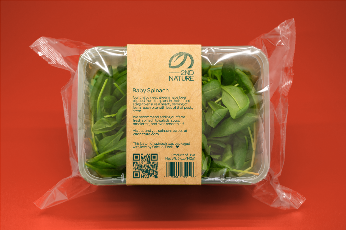
Their color palette is a fusion of freshness and flavor, preserving the rustic farm aesthetic they wish to evoke and integrating it into their branding whenever possible.


Perfecting Produce
The versatility of 2nd Nature's logo allowed me to create a comprehensive logo suite, offering a variety of layouts to suit their diverse needs. This suite includes multiple wide and stacked versions, along with their distinctive leaf icon, ensuring a perfect fit for all their collateral requirements.
