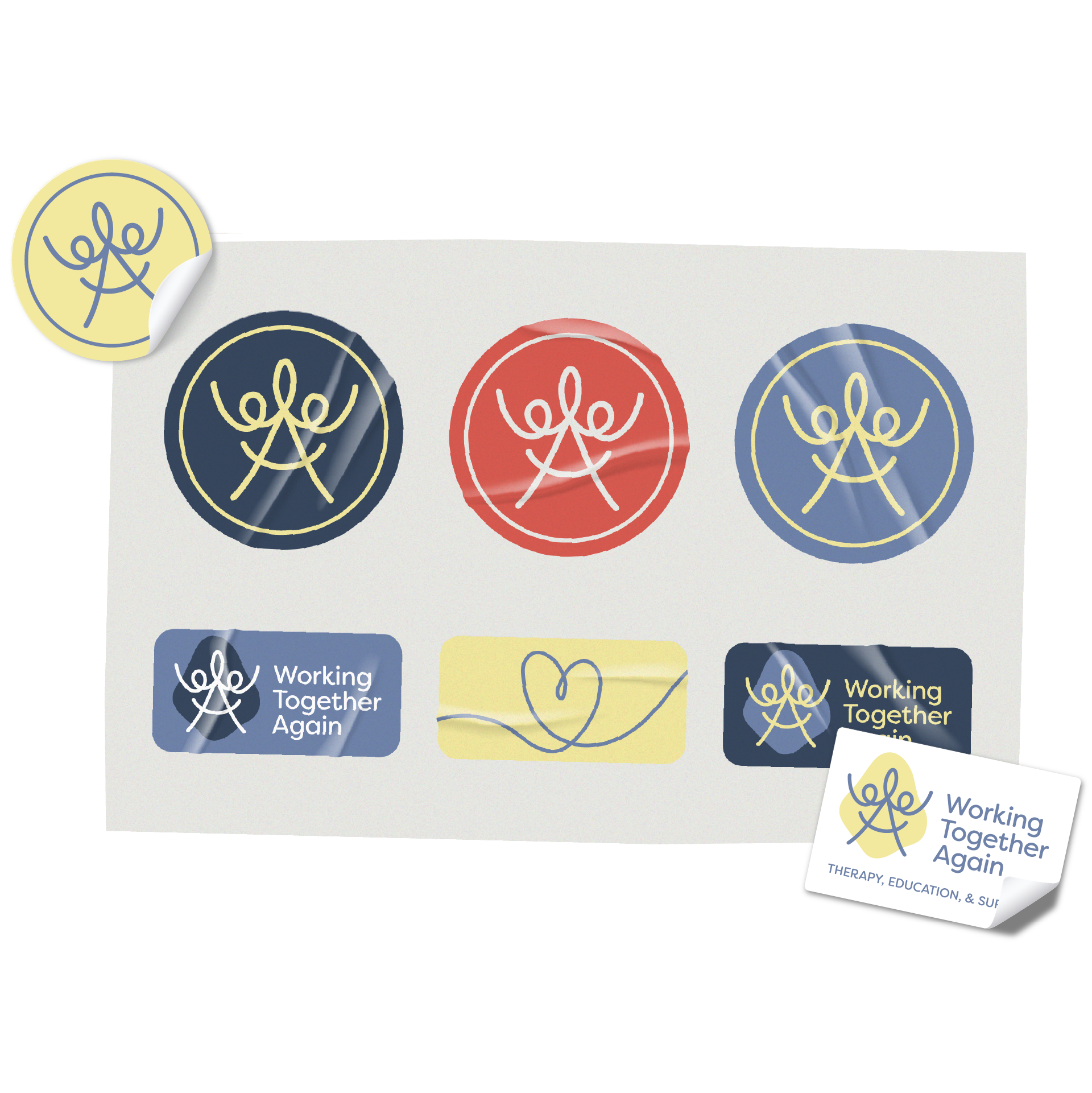
The logo is not just a symbol; it's a tapestry of meanings carefully woven to embody the brand's charitable mission. Picture this: the Greek "psi" character, a universal symbol for the mind and soul in psychology, entwined with the brand initials. Add two figures joyously holding hands in celebration, and a smiling face—all rendered in a playful line-art style. This unexpected amalgamation forms the final logomark, a minimal masterpiece that speaks volumes about WTA's unwavering dedication to the mental well-being and happiness of others.
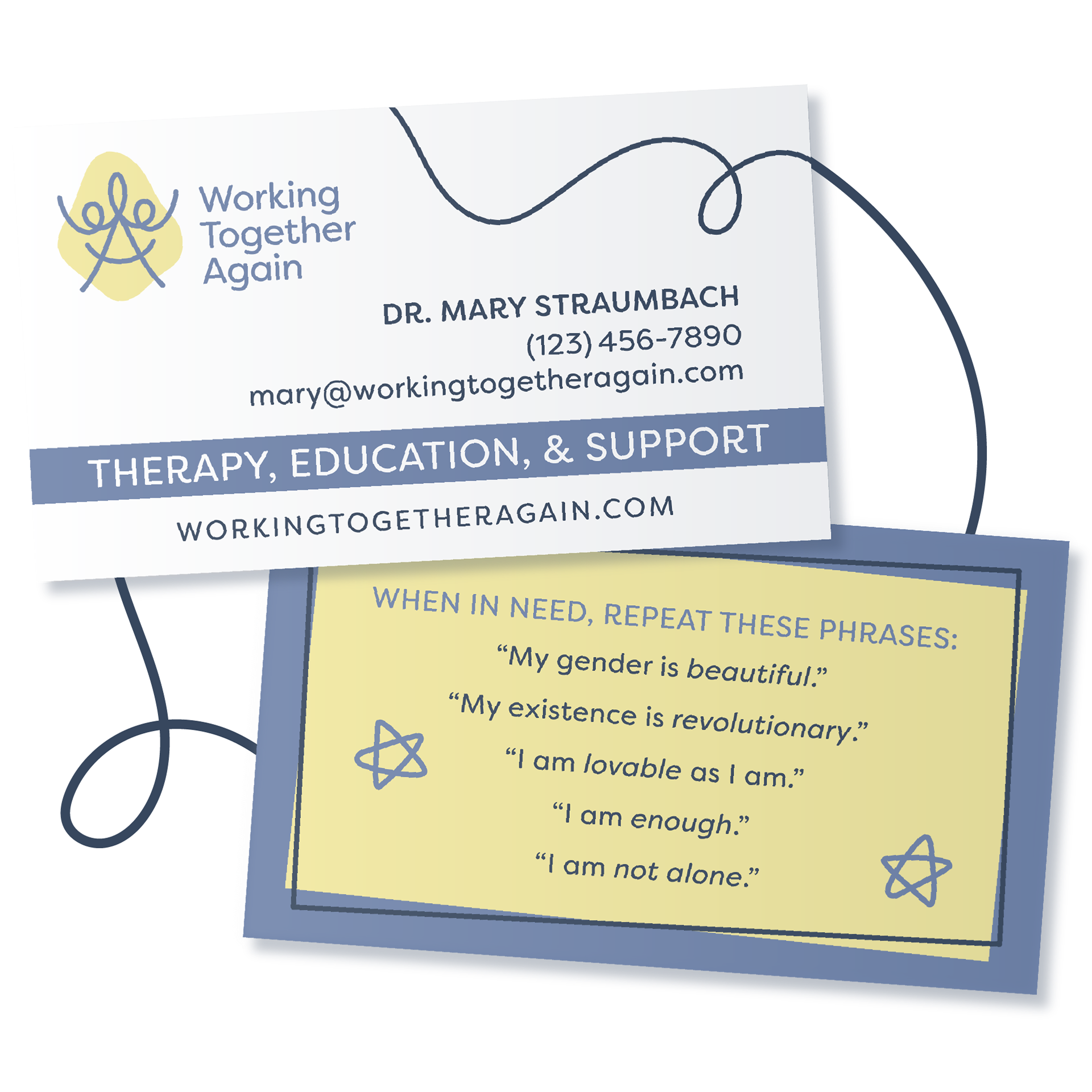
Bathed in hues that are both soothing and expressive, the figures in the emblem not only symbolize unity but celebrate the diverse tapestry of gender identities and sexualities. This visual harmony extends seamlessly to the custom icons, bespoke brand pattern, and fonts carefully chosen to echo their commitment to diversity and inclusion.
Working Together Again is not just about aesthetics; it's about creating a safe space for meaningful conversations. The focus? Teens and young adults navigating the intricacies of gender identity and sexuality. WTA's group therapy sessions and support groups aren't just offerings; they're lifelines, weaving connections among peers facing similar challenges.
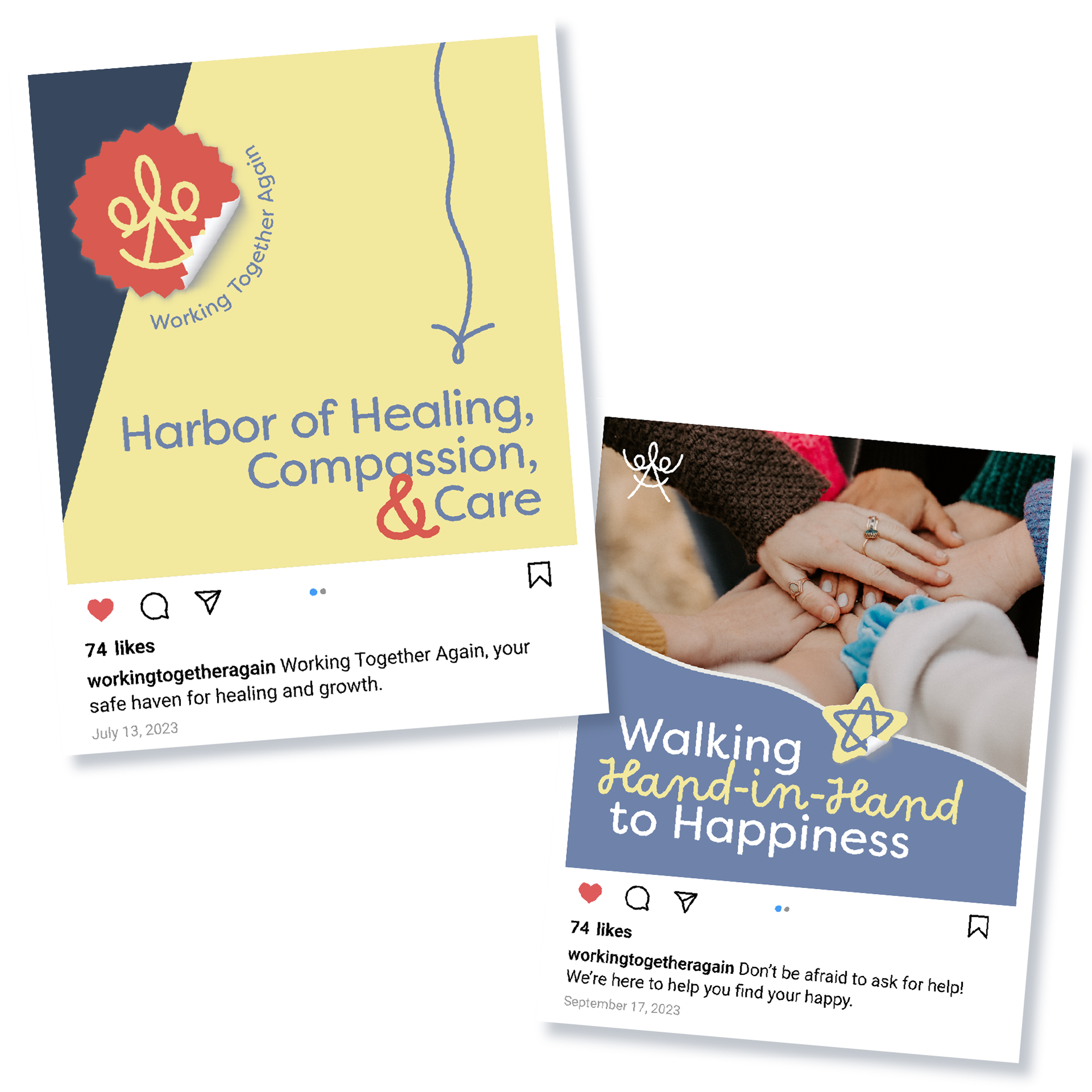
Picture a community that goes beyond the conventional, inviting you to share and explore without judgment. In every design decision, from the gentle curves of their logo to the vibrant hues in their social media templates, the goal is clear — to create a visual language that not only speaks but resonates, especially with those exploring the uncharted territories of identity.

Working Together Again is more than an initiative; it's a warm embrace, an open invitation to talk about anything. It's a welcome place to celebrate the uniqueness of your journey, providing solace and strength in a community that understands the transformative power of acceptance. Because your story matters, and at WTA, they're ready to listen, support, offer a helping hand, and walk this journey with you.
